Craft
The hand behind the direction.
Leadership is the work, but the hand never stops. Selected
illustration, identity, and visual work.
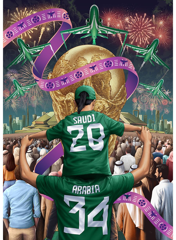
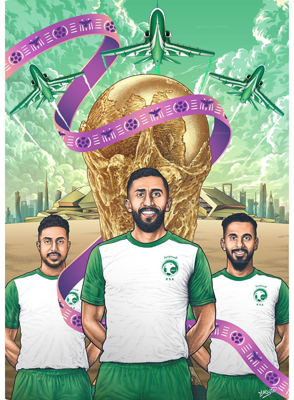
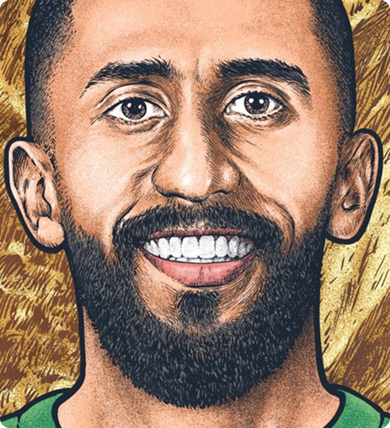
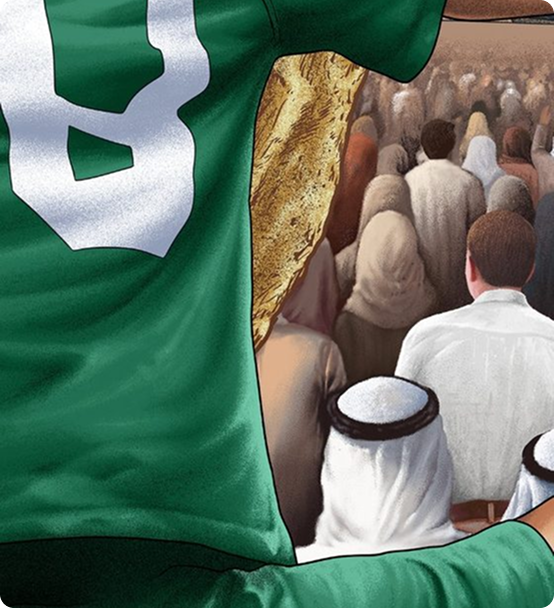
Saudi Arabia 2034
A commemorative illustration marking the Kingdom winning the right to host the FIFA World Cup 2034. The golden trophy rises over a future Riyadh skyline, framed by the national aerobatic formation, fireworks, and a crowd of every background. Shown as the full poster and a players' edition featuring the national team, with close details revealing the hand-rendered linework beneath the color.
Octopus
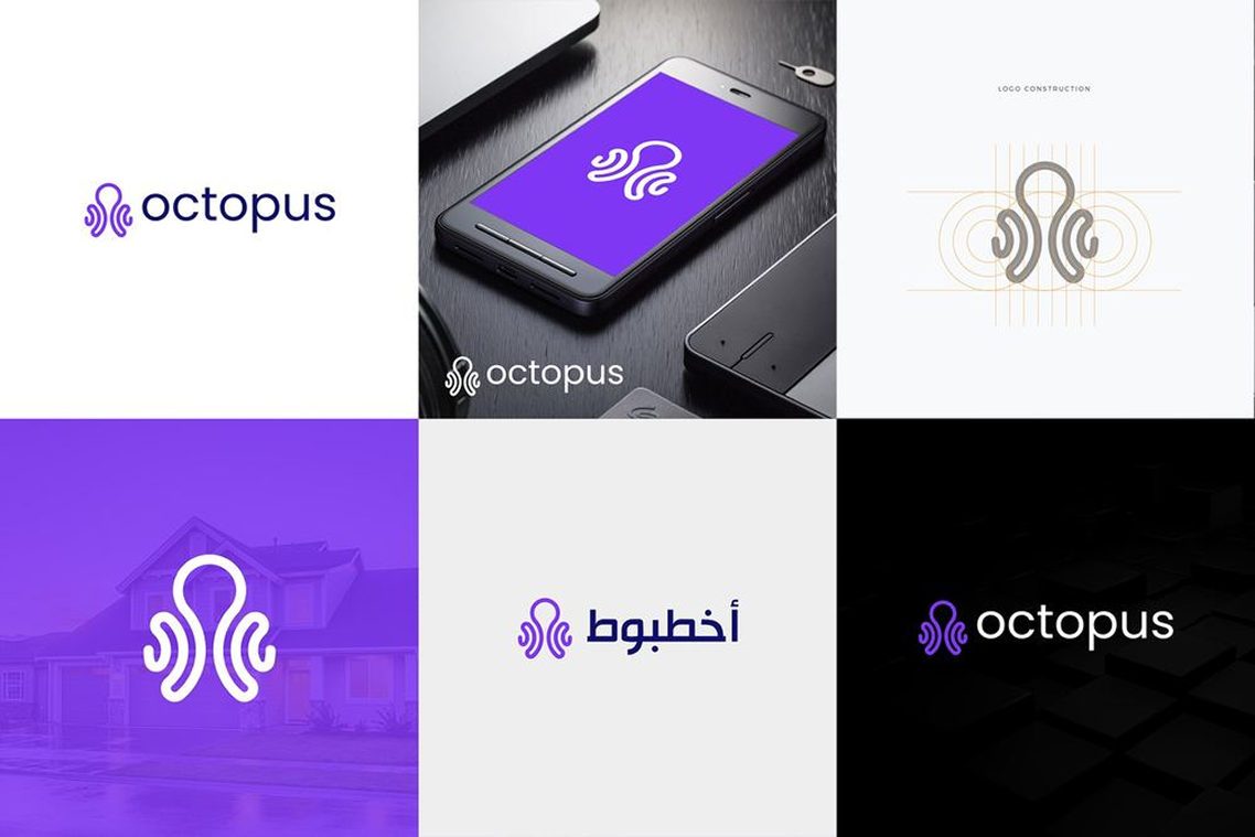
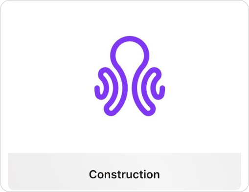
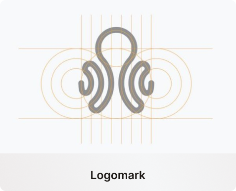
A brand identity for Octopus, an on-demand home services platform connecting households with verified cleaners, gardeners, and cooks. The octopus turns the idea into the promise: with eight arms at your service, you have more than one hand. The monoline mark is drawn on a strict geometric grid so it holds from an app icon to a building sign, and carries a bilingual lockup in English and Arabic.
Founding to Future
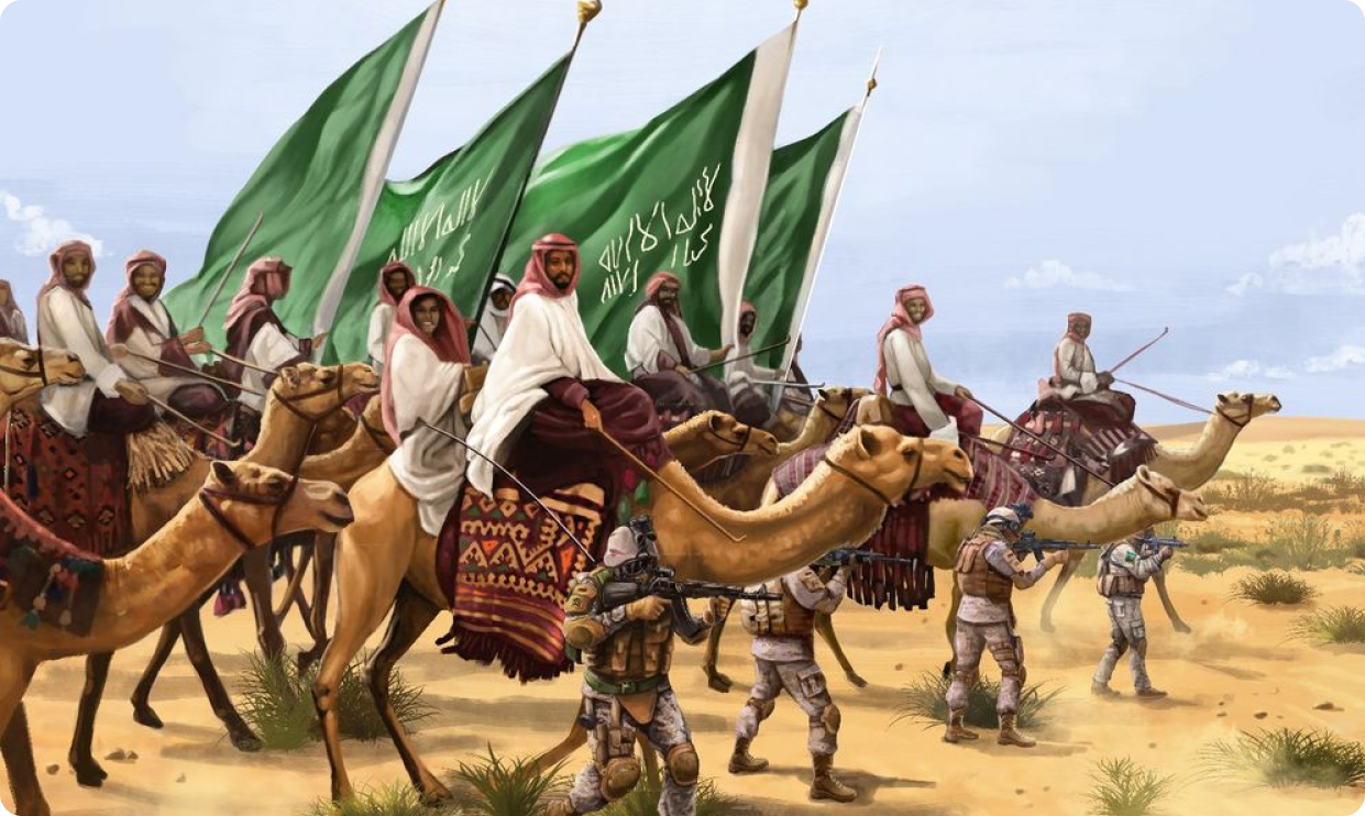
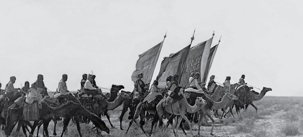
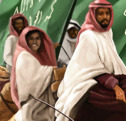
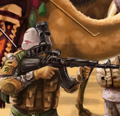
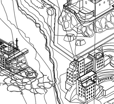
Created to mark Saudi National Day and the unification of the Kingdom. The painting is built from a well-known historical photograph of the early Saudi army on camelback, reimagined with the modern force and its equipment marching in the same line, so a single frame carries the full arc from the founding to the army of today.
The Heritage Maze
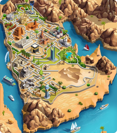
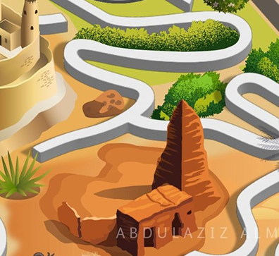
An educational poster that teaches children and teenagers about the landmarks of Saudi Arabia by turning the map into a maze. Few people know the Kingdom holds eight UNESCO World Heritage Sites, so the route winds through its regions and landmarks, asking you to come to know the country by traveling it. It rests on a belief I hold about the work: a designer’s job is not only to command the tools, but also to take responsibility for solving a problem.

Watheeq
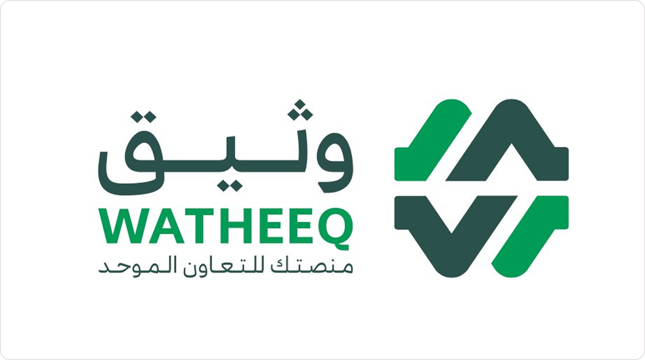
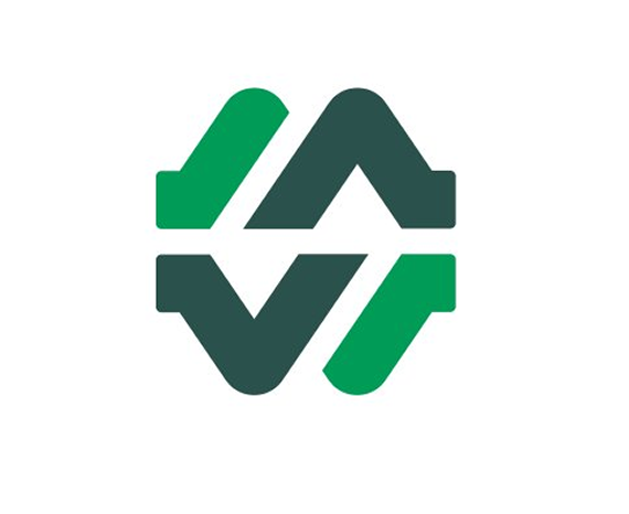
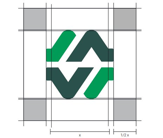
A brand identity for Watheeq, a secure internal communications platform connecting the departments of a government ministry across its many locations. The name is drawn from the Arabic word for trust, and the symbol carries the same promise. Interlocking arrows that meet to move information quickly and safely between teams. Built on a strict geometric grid, the mark encodes connectivity, collaboration, reliability, and a protected environment, holding its form in full color, reversed or white over imagery, and as a single monoline icon.
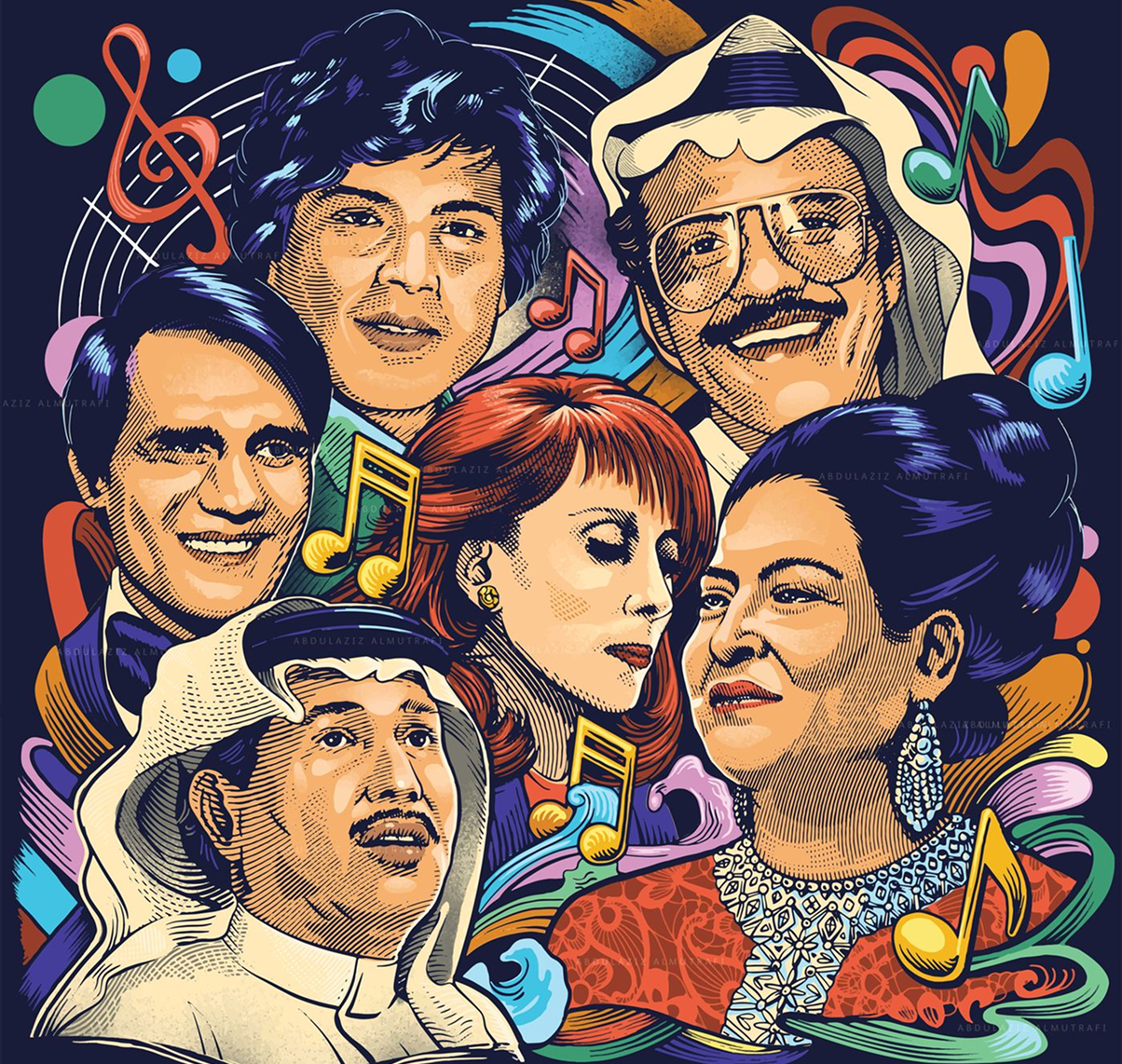
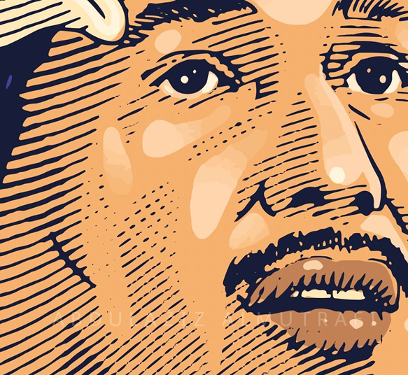
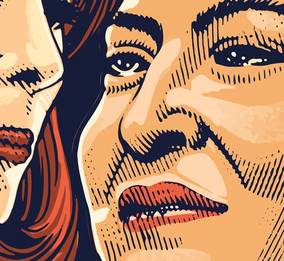
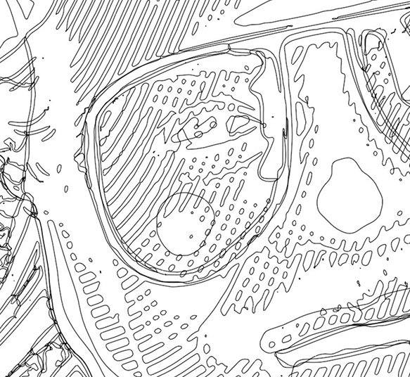
Voices of Arab Song
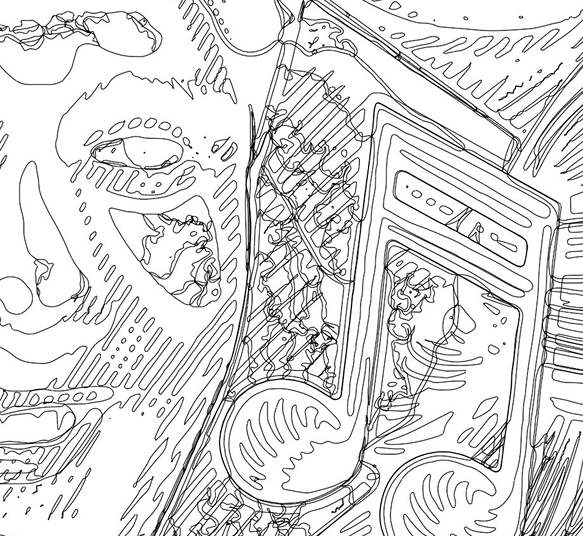
A digital illustration bringing together the great voices of Arab music, the singers whose influence reached far beyond the borders of their own countries. Every face is built in Adobe Illustrator from fine engraving-style hatching and flat color, set among notes and ribbons that gather a whole generation into a single chorus. Shown as the full composition, with close details that reveal the density of the linework and shading, and the base vector build that sits beneath the color.
Hope
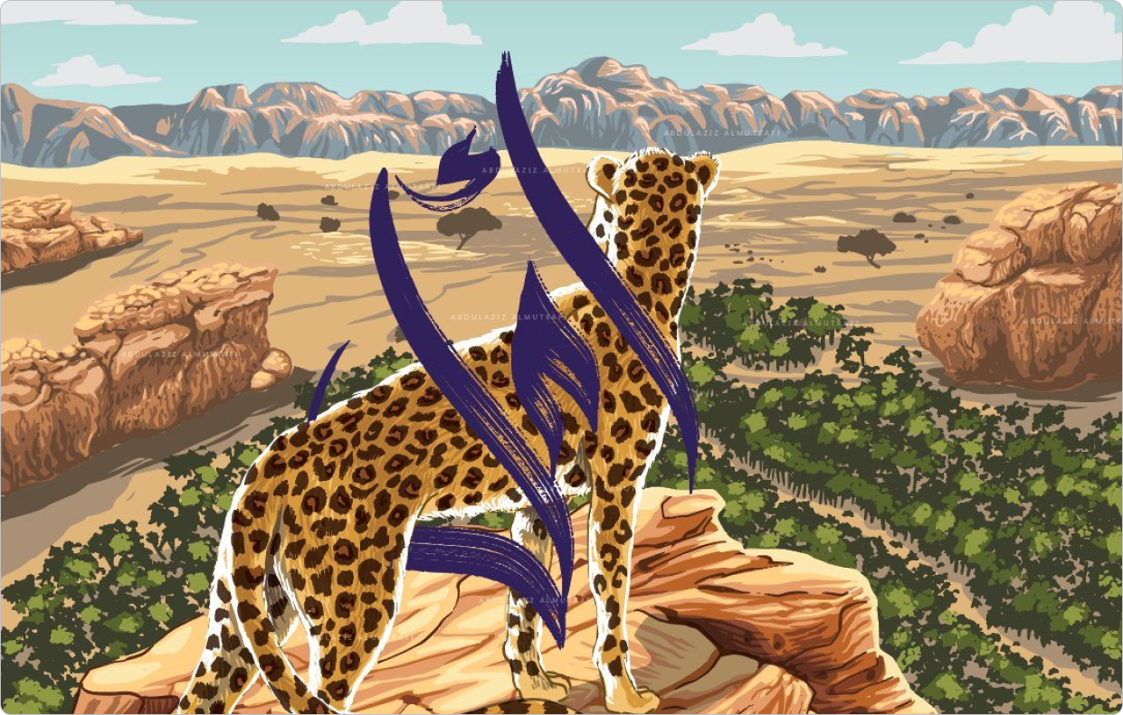
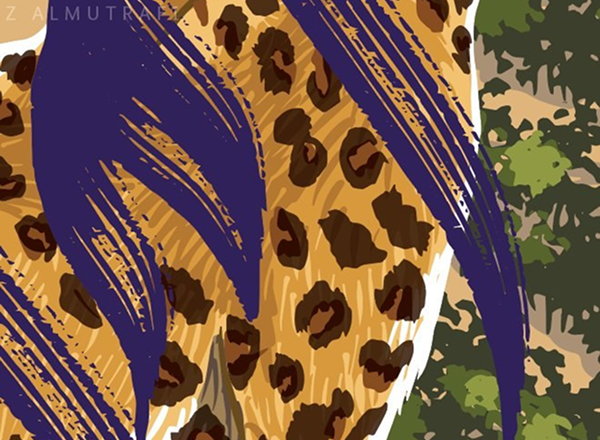
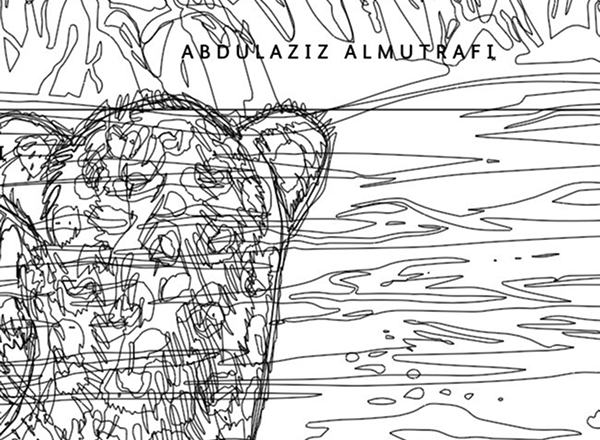
Hope is a digital illustration of the Arabian leopard standing on a mountain peak in its native range, gazing out at the horizon for the day it might return to this land. Once spread across the region, the leopard has been pushed to the edge by hunting and habitat loss, and is now the focus of urgent conservation work across the Kingdom. Every spot on its coat stands for one of the animals believed still to survive, so the painting reads as a quiet census, a record of where the count sits today and a question of whether we will be the reason it climbs or the reason it disappears.
Printing Press Department
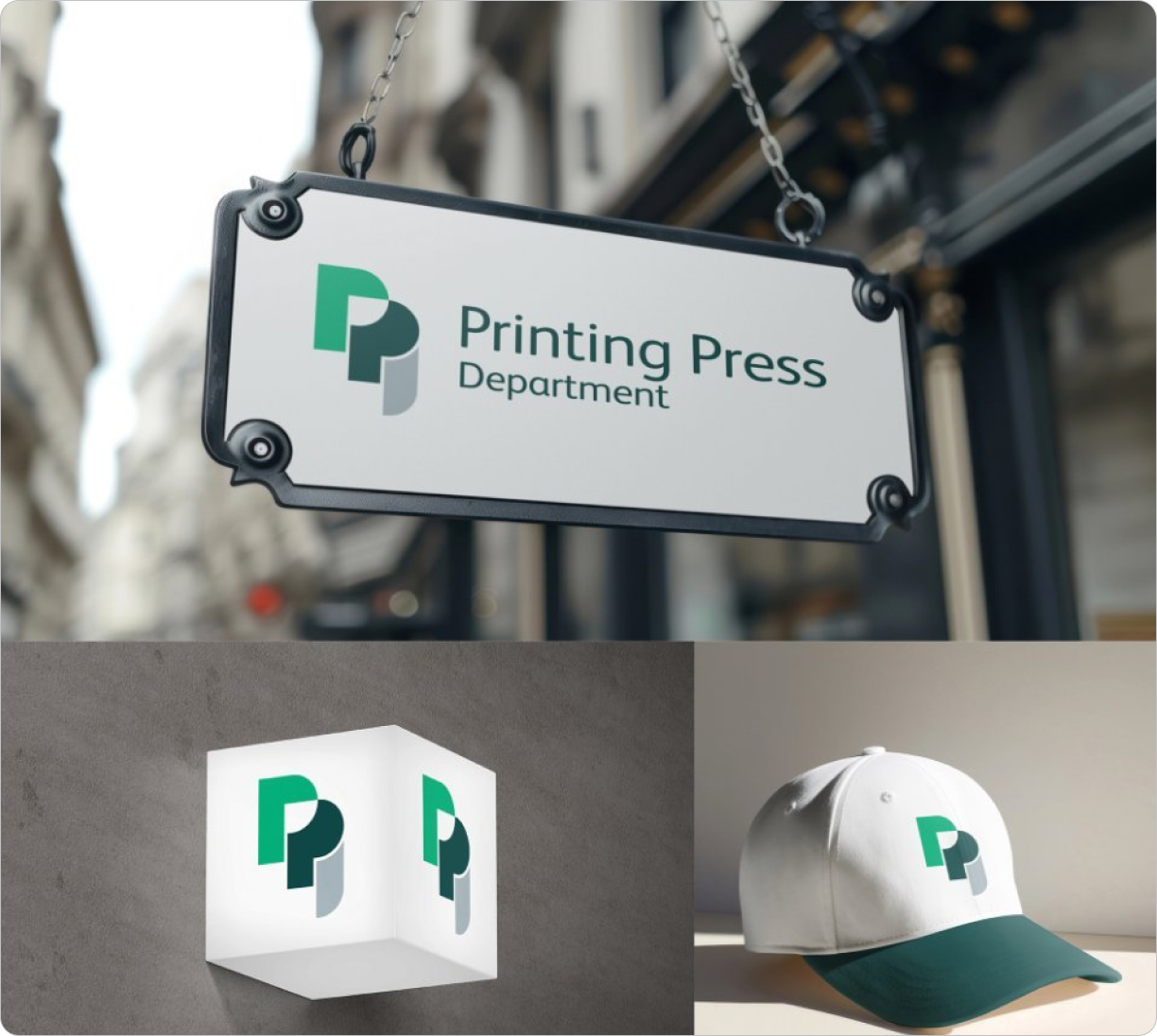
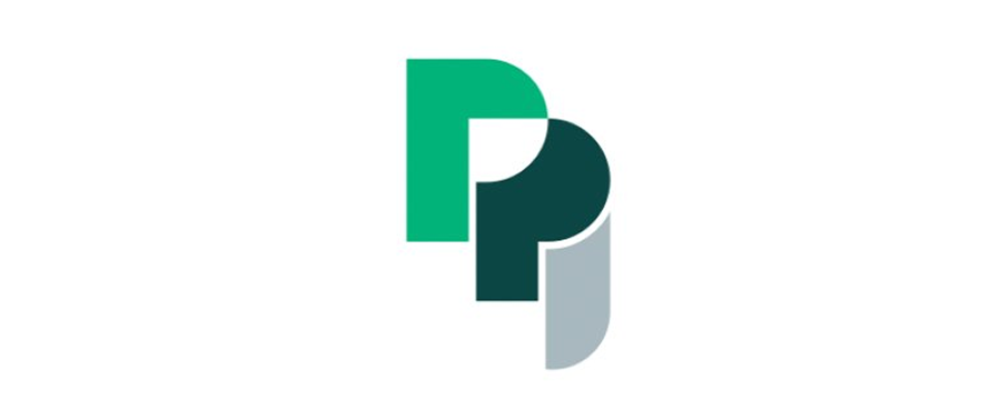
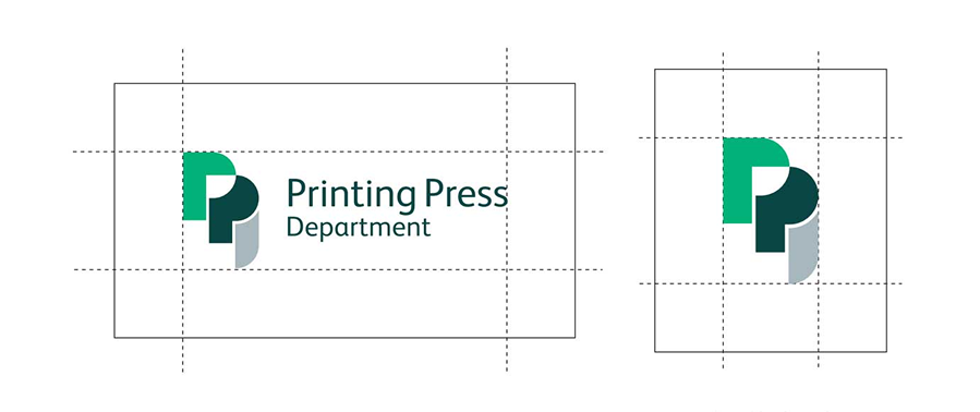
A logo and identity for the Printing Press Department, built around a simple idea: two letter Ps that also read as a stack of paper. The mark is built from type, but once simplified becomes a symbol for the press, and a clean production icon. Shown here on an exterior sign, cap, cube, and a hat application that ties the department’s visual language together into a small, expandable system.
SIDR
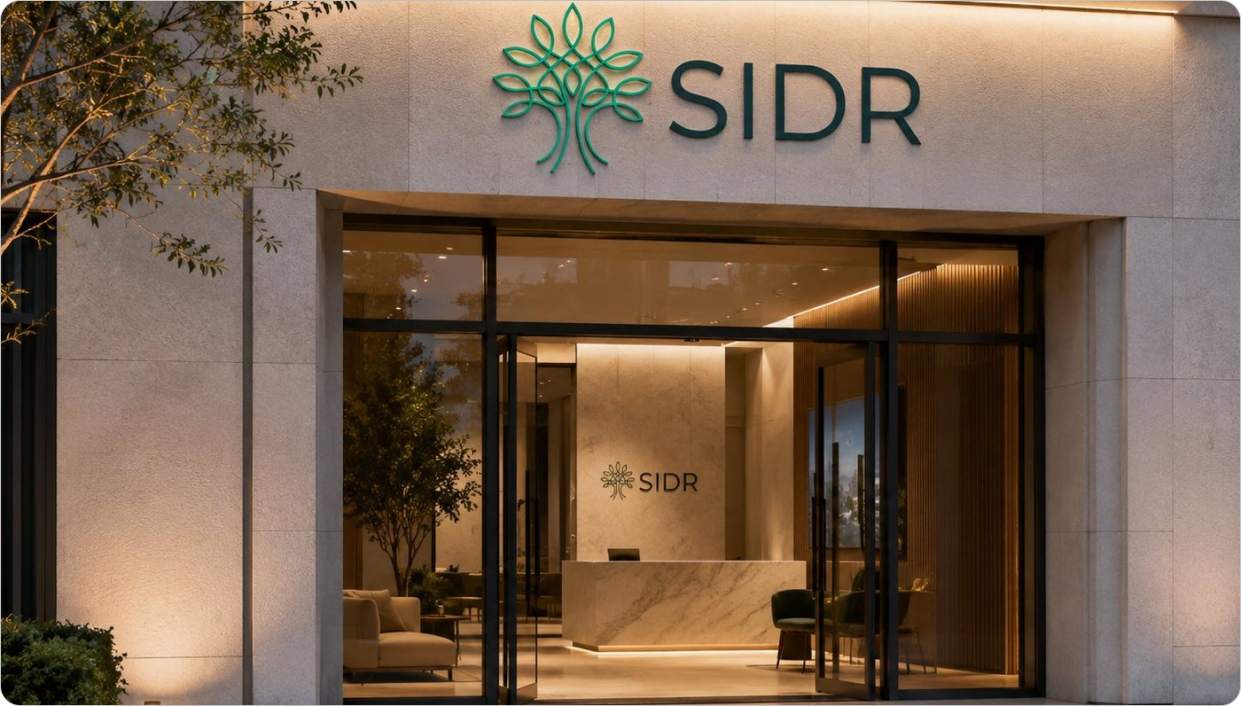
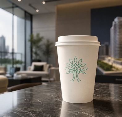
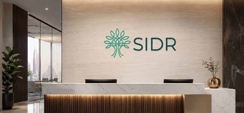
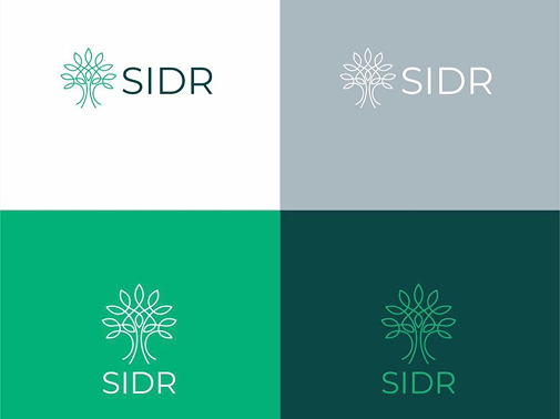
A logo and identity for Sidr, a real estate company named after the sidr tree, a species that thrives in the heat and drought of the desert and has long given travelers shade and shelter from the sun. The mark draws that idea as a single continuous line rising into a canopy of leaves: calm, rooted, and generous. Carried in a palette of deep evergreen and soft sage, the identity sits as easily on a building entrance and a lobby wall as it does on a coffee cup, and frames the company’s promise to be a refuge for anyone searching for a place to call home.